Logo
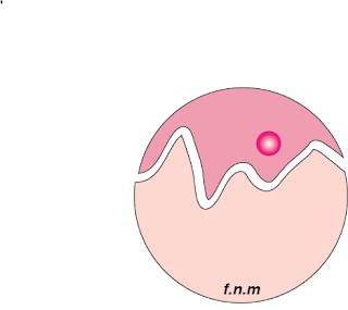
The pink in my logo stands for, femininity, love, sexuality, LGBT culture, fun, youth, and flamboyance.
I chose these pinks to be aesthetic, but to also promote youth, femininity, and love. I want people to feel comfortable and at home with my logo. I added the mountains in my logo to say that anyone can mentally improve or rise mentally.
I added my initials to give it personality and to make it my own.


great message! it really applies to the logo!
ReplyDeleteI like how its very simple and stands out and it shows all the personality you said and has a very simple build yet a bright vibrant outer look. Also i like the gap in the middle because it makes it stand out and shows a contrast of colors.
ReplyDeleteI like how you had your colors symbolize something. I like how the design is simple but means something.
ReplyDeletei really like how your basically have one main color but all of them bring out each other. Nice Work!
ReplyDeleteWhen I look at your logo it relaxes me. It's really simple so it stands out a lot more. Way to go!
ReplyDelete